library(ggplot2);
library(dplyr);DIY hexbin Santa Claus
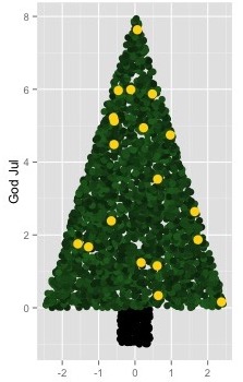
For the past four years, I’ve made my Christmas cards in R. It started the first year of my master’s. With finals looming, I spent several evenings in December making a ggplot2 Christmas tree. On the distinctly un-Christmas-y default grey background.
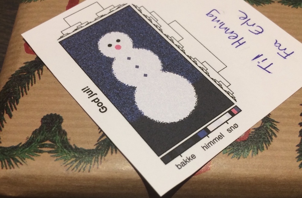
Then I interned in a bioinformatics lab and started using their data visualization package. It culminated in a snowman heatmap with dendrograms decorating all of my 2017 Christmas presents.
This year, I’ve been getting back into ggplot2, both professionally and recreationally. I started a new job in September, and for the first time in my very short career, there are no workplace data visualization policies. I’m free to use whatever tools I’d like.
There’s one caveat though: my new coworkers have extremely low tolerance for overplotting. I spent my first few months in the job progressively lowering scatterplot alpha levels, but eventually I had to face the inevitable: people really wanted hexbin plots.
A hexbin plot is a type of two-dimensional histogram. The \(x\) and \(y\)-axes are divided into bins, and the colour shows the number of points falling into each bin. This colouring means we can see how the data is distributed even when there are too many points to show individually.
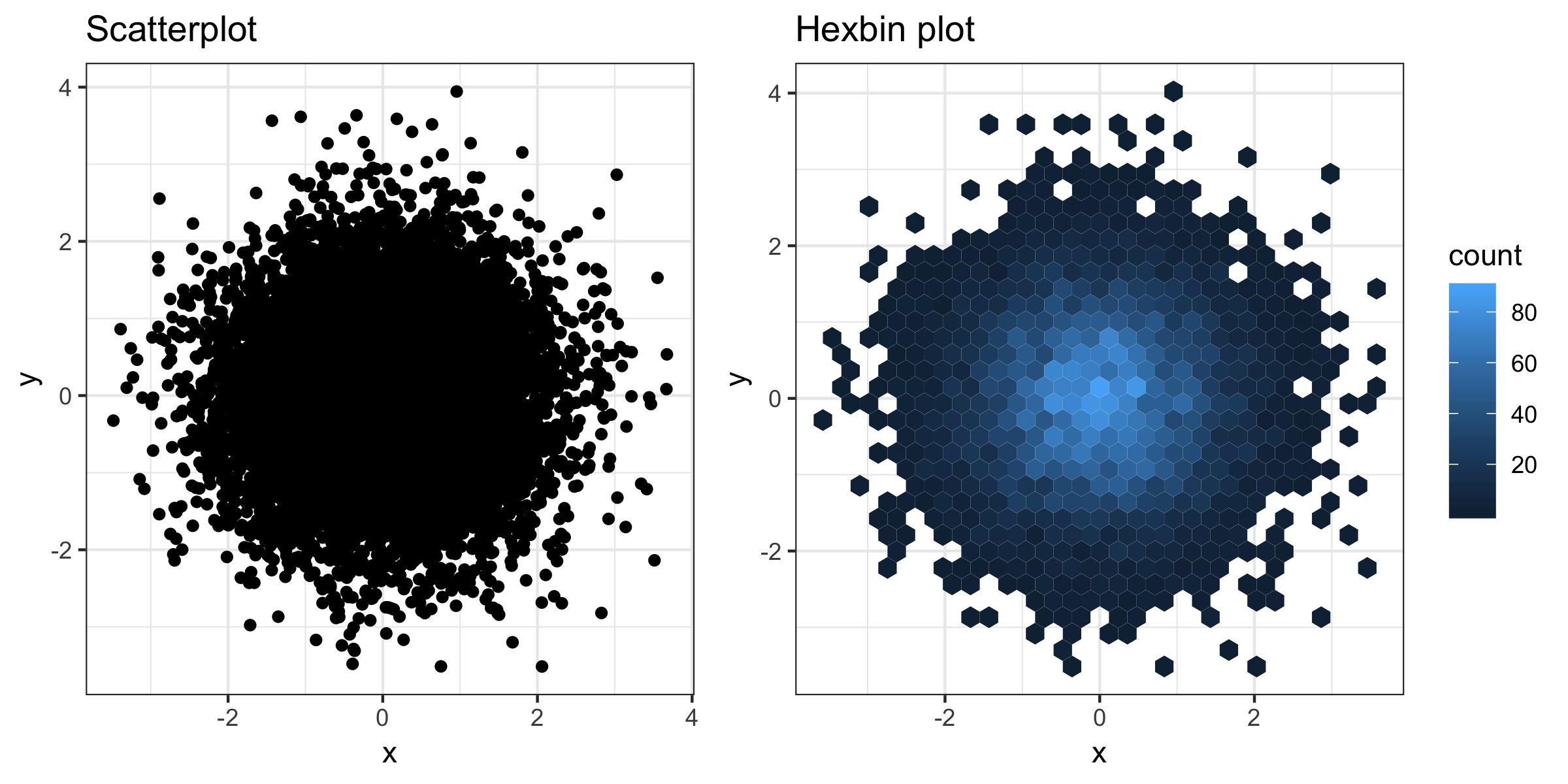
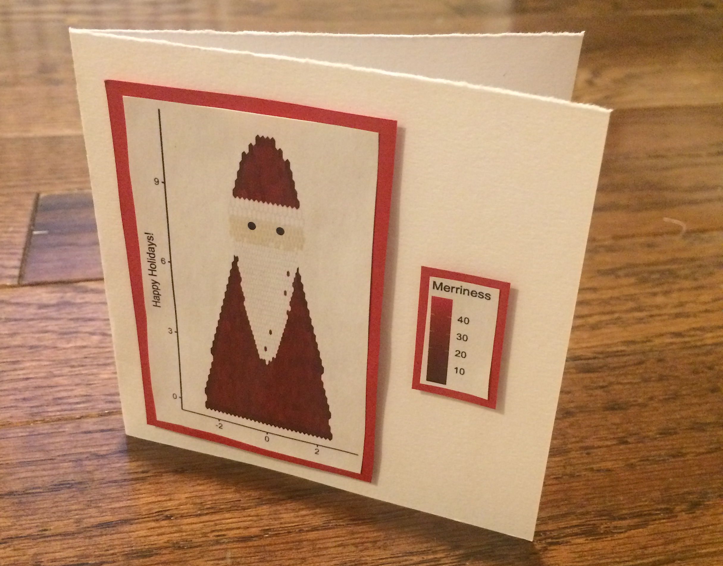
Hexbin plots can take some getting used to, but I decided to embrace them. I let my work-in-progress Santa Claus scatterplot be reborn in hexbin form. A Christmas card without overplotting!
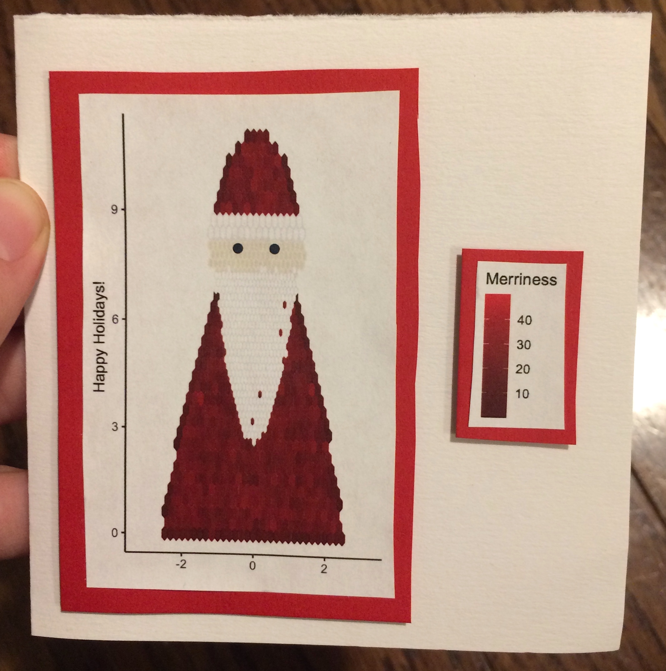
After I posted the picture on Twitter, a few people have asked me for code. Generally I have more opportunities to write about R than DIY craft projects, so I figured I’d take this chance to do both.
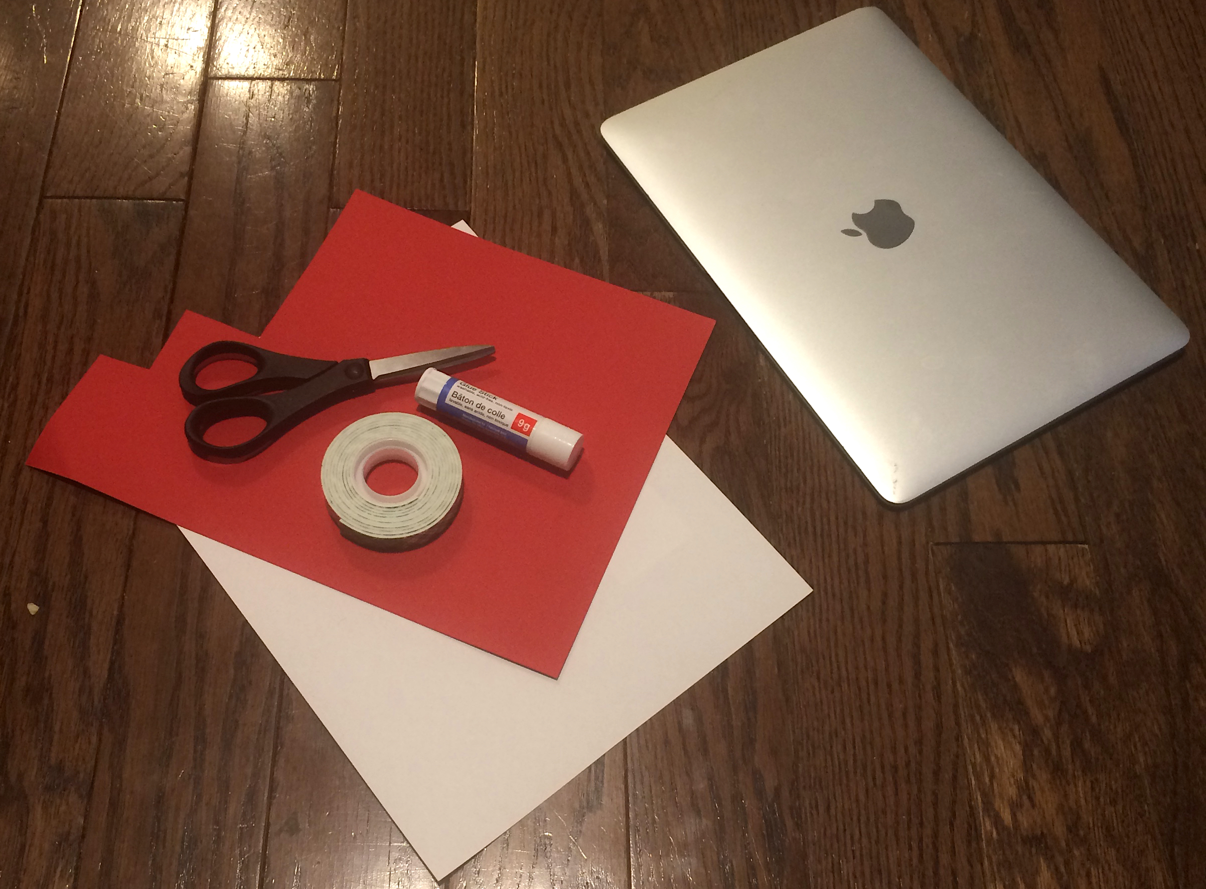
What you’ll need
- R with ggplot2
- White and coloured paper
- Scissors
- Glue
- Double-sided foam tape
Drawing Hexbin Santa
We’ll build our Santa layer by layer, going form back to front. ggplot2 makes it easy to add new components by repeatedly calling geom_hex() with the new data we’d like to visualize. I also loaded dplyr to help with some of the data wrangling steps.
To start off, I needed something that could look like a body. Ideally this would have had arms, legs, and a massive belly, but I had to work within the limits of my R skills (and patience). I opted for a shape I could work out with simple math: a polynomial.
As we all learned in high-school math, a second degree polynomial is given by the formula \[ f(x) = ax^2 + bx + c \]
I centered my Santa Claus at zero to get rid of the \(bx\) term, and solved for \(a\) and \(c\) to satisfy my desired Santa height \(h\) and width \(w\). The formula for the boundary works out to
\[ f(x) = - \frac{4h}{w^2}x^2 + h \] If you’d like to get fancy, you can re-scale this to a probability density function, generate random \(y\)-values from the distribution, and \(x\)-values uniformly in \([-x^*, x^*]\), where \(x^*\) is the positive number such that \(f(x^*) = y\).
Personally, I couldn’t be bothered. I generated random numbers within the rectangle \([-\frac{w}{2}, \frac{w}{2}] \times [0, h]\), and discarded all the ones that fell above the polynomial. This technique is known as rejection sampling, and it’s computationally inefficient. Still, Christmas is only once a year, and I decided to splurge.
width <- 5;
height <- 8;

n_body <- 15000;

# polynomial giving boundary of santa
santa_boundary <- function(x, width, height) {
    a <- -4*height/(width^2);
    c <- height;

    return( a*x^2 + c);
}

# sample with rejection region
# not the most computationally efficient, but should work
x <- runif(n_body, -width/2, width/2);
y <- runif(n_body, 0, height);

santa_body <- data.frame(
    x = runif(n_body, -width/2, width/2),
    y = runif(n_body, 0, height)
    );

santa_body <- santa_body %>% filter(y < santa_boundary(x, width, height) );
To make Santa’s coat look more realistic, I added a gradient of red with the scale_fill_gradient() function. Due to random chance, there’s some variability in how many points fall into each bin. By colouring each bin based on the count, we can incorporate many shades into the coat.
I also applied the coord_fixed() function to make sure Santa would be drawn to scale.
g <- ggplot(santa_body, aes(x, y)) +
    geom_hex() +
    scale_fill_gradient(low = 'red4', high = 'red2') +
    coord_fixed();

plot(g);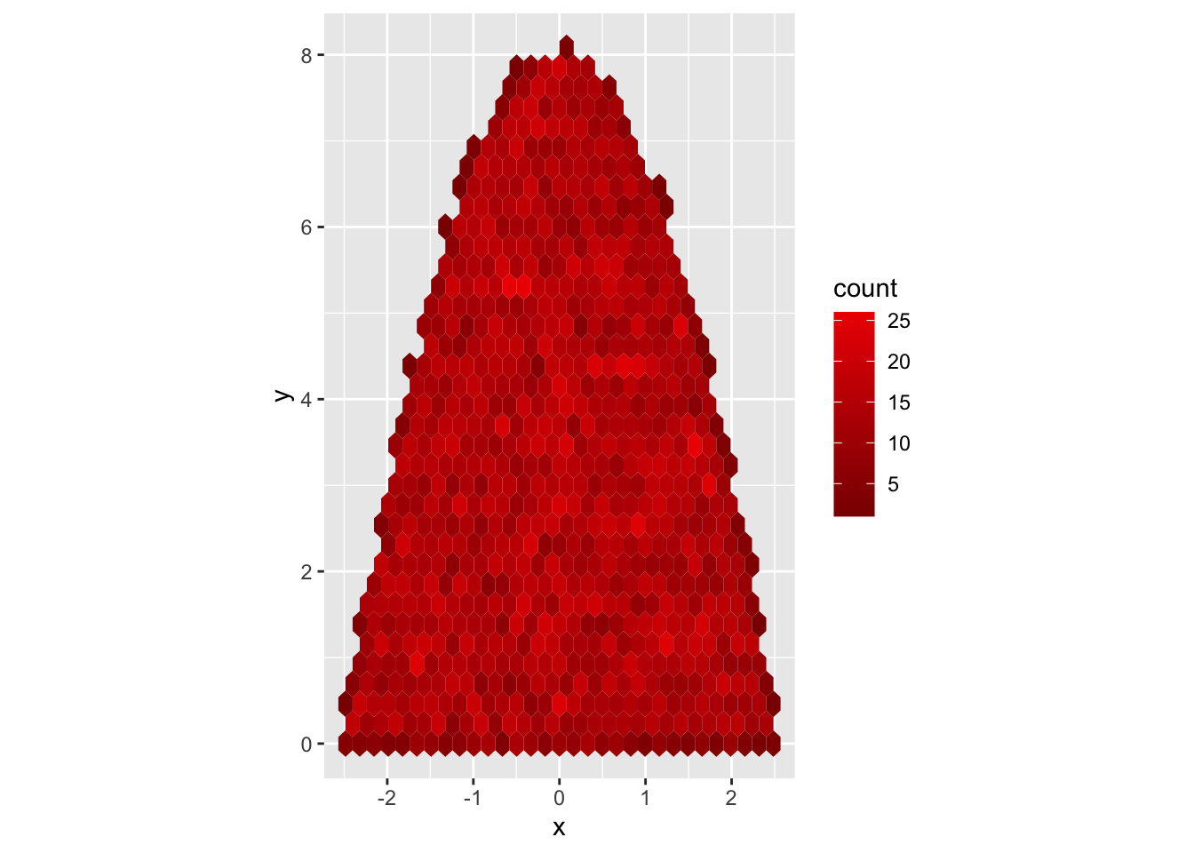
Not a bad start!
Next, I turned to Santa’s head. For previous Christmas creations I’ve used a bivariate normal distribution to create circles. However, this approach results in frayed edges - not a great look for heads.
Instead, I did another rejection sampling step. I generated points from two uniform distributions and filtered out all the points falling outside the circle.
n_head <- n_body/7;
head_diameter <- 2.5;

# generate random numbers in square around 0
# we'll move this to our desired height afterwards
santa_head <- data.frame(
    x = runif(n_head, -head_diameter/2, head_diameter/2),
    y = runif(n_head, -head_diameter/2, head_diameter/2)
    );

# filter out to make circle, lift to height of Santa
santa_head <- santa_head %>%
    filter(x^2 + y^2 < (head_diameter/2)^2 ) %>%
    mutate(y = height + y);
ggplot2 only supports a single aesthetic colour scale per plot. Since we’ve already applied scale_fill_gradient() once for the coat, we can’t call it with a different set of colours for Santa’s face. What we can do is to set all bins to be a different, fixed colour by specifying fill outside of the aes() function.
To make the resulting, beige circle look a bit more appealing, I added a lighter edge (col='cornsilk2') and reduced the bin size.
g <- g + geom_hex(
        data = santa_head,
        fill = 'cornsilk2',
        col = 'beige',
        bins = 40
        );

plot(g);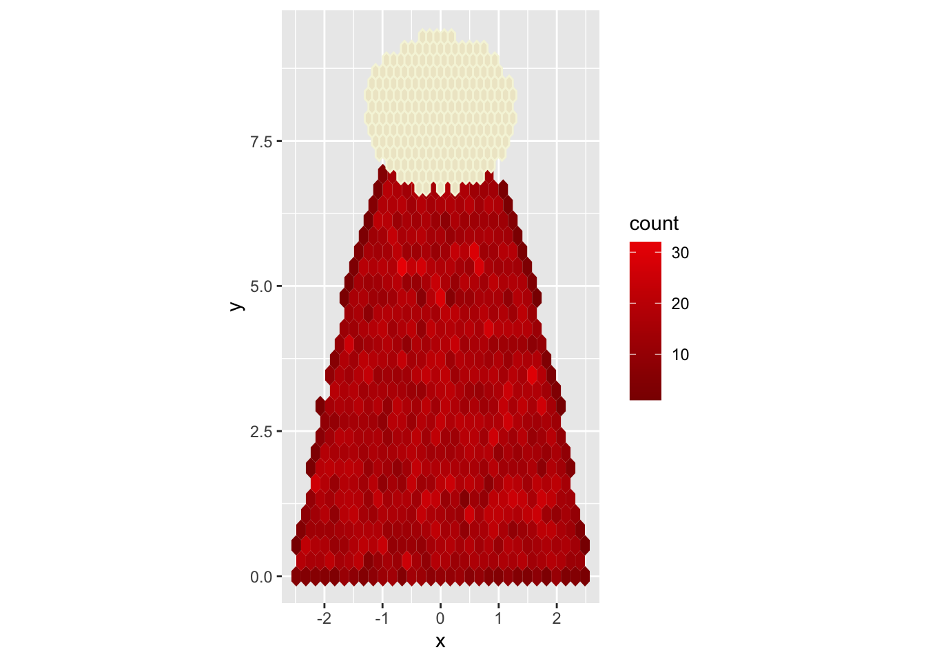
For Santa’s beard, I constructed a new polynomial. Let \(k_{min}\) denote the lowest point of the beard, \(k_{max}\) denote its highest point, and \(w_b\) denote its width at the highest point. The boundary is given by:
\[ f(x) = \frac{4(k_{max} - k_{min})}{w_b^2}x^2 + k_{min} \]
k_min <- height/3;
k_max <- 0.94*height;
w_beard <- 0.9*head_diameter;
n_beard <- n_body/5;

beard_boundary <- function(x, k_min, k_max, w_beard) {
    c <- k_min;
    a <- 4*(k_max - k_min)/(w_beard^2);

    return( a*x^2 + c);
}

santa_beard <- data.frame(
    x = runif(n_beard, -w_beard/2, w_beard/2),
    y = runif(n_beard, k_min, k_max)
    );

santa_beard <- santa_beard %>%
    filter(y >= beard_boundary(x, k_min, k_max, w_beard));

g <- g + geom_hex(
        data = santa_beard,
        fill = 'white',
        col = 'gray90',
        linewidth = 0.2,
        bins = 50
        );

plot(g);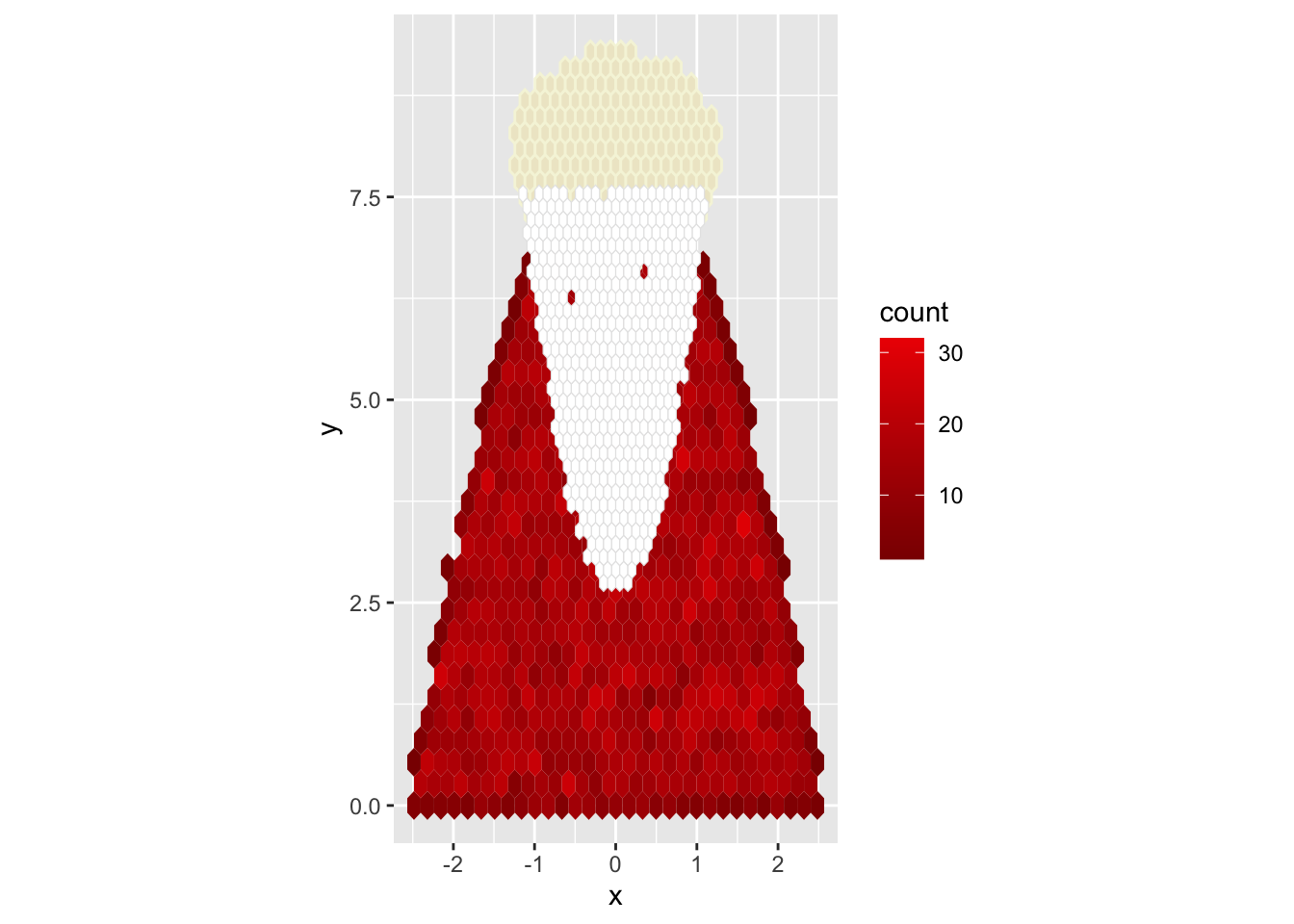
The next step is to add a hat. No surprises there: I constructed another polynomial.
min_y <- 1.05*height;
max_y <- min_y + height/3;
max_width <- 0.93*head_diameter;
n_hat <- n_body/5;

hat_boundary <- function(x, min_y, max_y, max_width) {
    c <- max_y;
    a <- -4*(max_y - min_y)/(max_width^2);

    return( a*x^2 + c);
}

santa_hat <- data.frame(
    x = runif(n_hat, -max_width/2, max_width/2),
    y = runif(n_hat, min_y, max_y)
    );

santa_hat <- santa_hat %>%
    filter(y <= hat_boundary(x, min_y, max_y, max_width));

g <- g +
    geom_hex(data = santa_hat);

plot(g);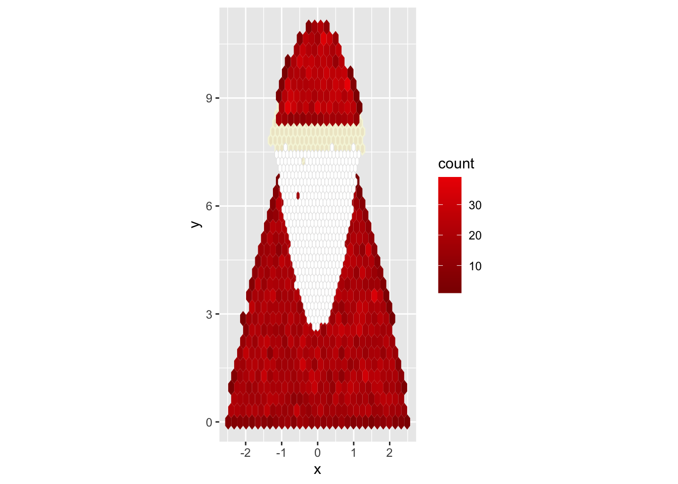
It doesn’t quite look like Santa hat yet: it still needs a white brim. I experimented with width, height, and dot-density until I found something that gave me a nice, uniform white band.
n_white <- 1000;
santa_hat_white <- data.frame(
    x = runif(n_white, -0.95*head_diameter/2,  0.95*head_diameter/2),
    y = runif(n_white, min_y, min_y + 0.045*min_y)
    );

g <- g + geom_hex(
        data = santa_hat_white,
        fill = 'white',
        col = 'gray93',
        linewidth = 0.5
        );

plot(g);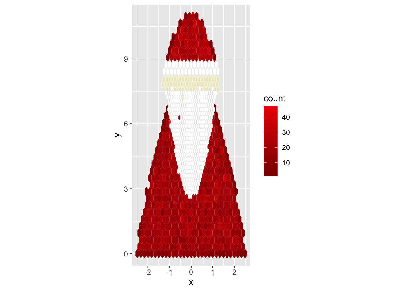
At this point, all the core components are in place. We only need to tweak a few details. Most importantly, Santa needs eyes. I chose a simple, two-dot scatterplot. I also tried to make the labels and overall look more festive. I switched to theme_classic() to get rid of the grey background and changed the legend to be a barometer for merriness.
eye_offset <- 0.5;
eyes <- data.frame(
    x = c(-eye_offset, eye_offset),
    y = rep(height, 2)
    );

g <- g + geom_point(data = eyes, col = 'darkslategray', cex = 2.7) +
    xlim( -1.3*width/2, 1.3*width/2) +
    xlab('') +
    ylab('Happy Holidays!') +
    labs(fill = 'Merriness') +
    theme_classic();

plot(g);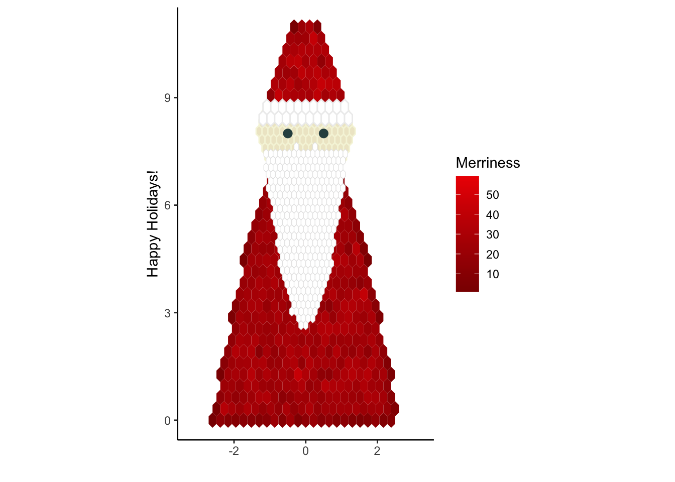
Assembling the Card
Now it’s time to take our creation to hard copy. I printed the finished graph on regular US letter paper. You can decide on the size yourself, but I found six copies to a page worked well.
After printing, I cut the legend apart from the main plot.
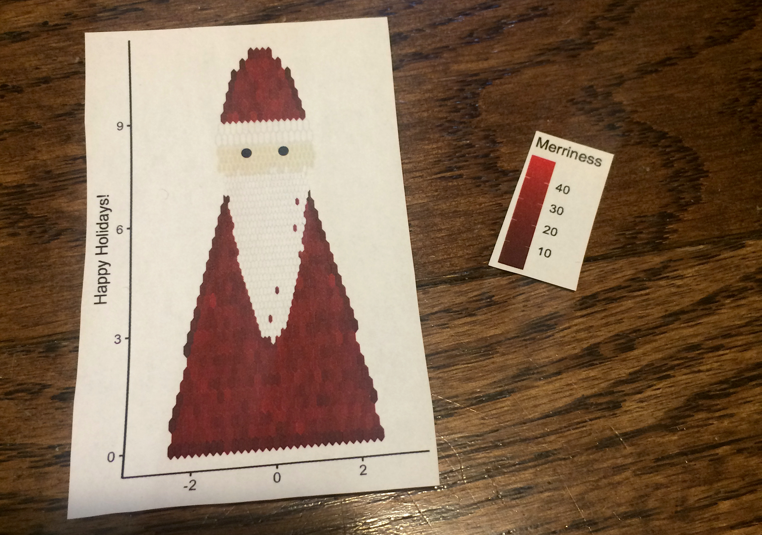
Regular paper is too flimsy for a Christmas card, so I glued the plot onto red, heavier paper. Depending on how good your glue is (mine was bad), you might want to wait until it dries before proceeding.
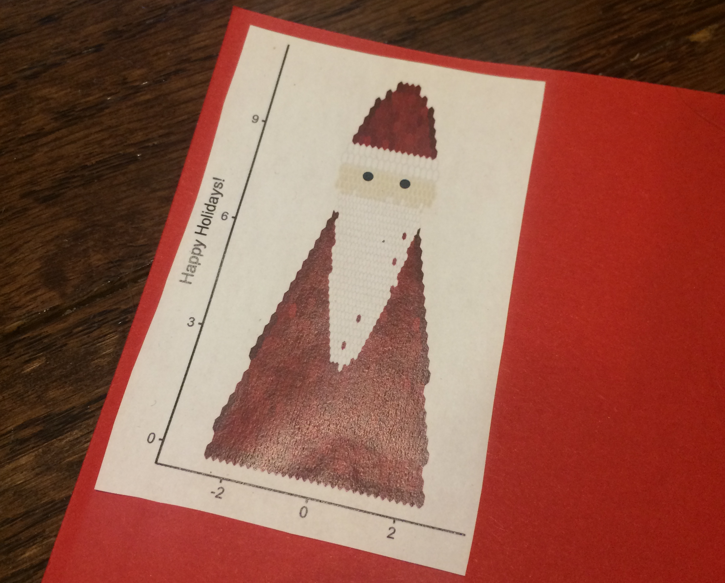
After the glue had dried, I cut the paper into a small rectangle and repeated the process for the legend.
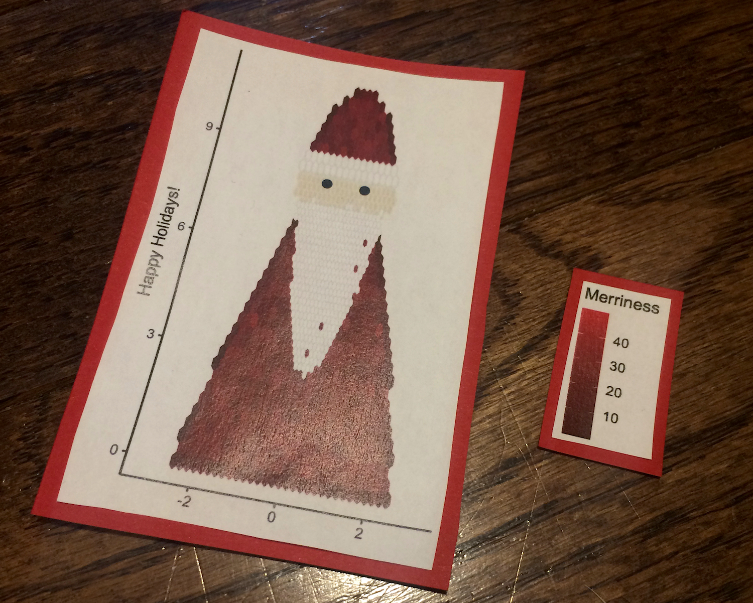
For the card itself I took the simplest possible approach. I used part of a white sheet of paper, folded in half. To give the finished result a bit more depth, I used the double-sided foam tape to stick Santa and the legend onto the white card. I put six pieces on Santa and one on the legend.
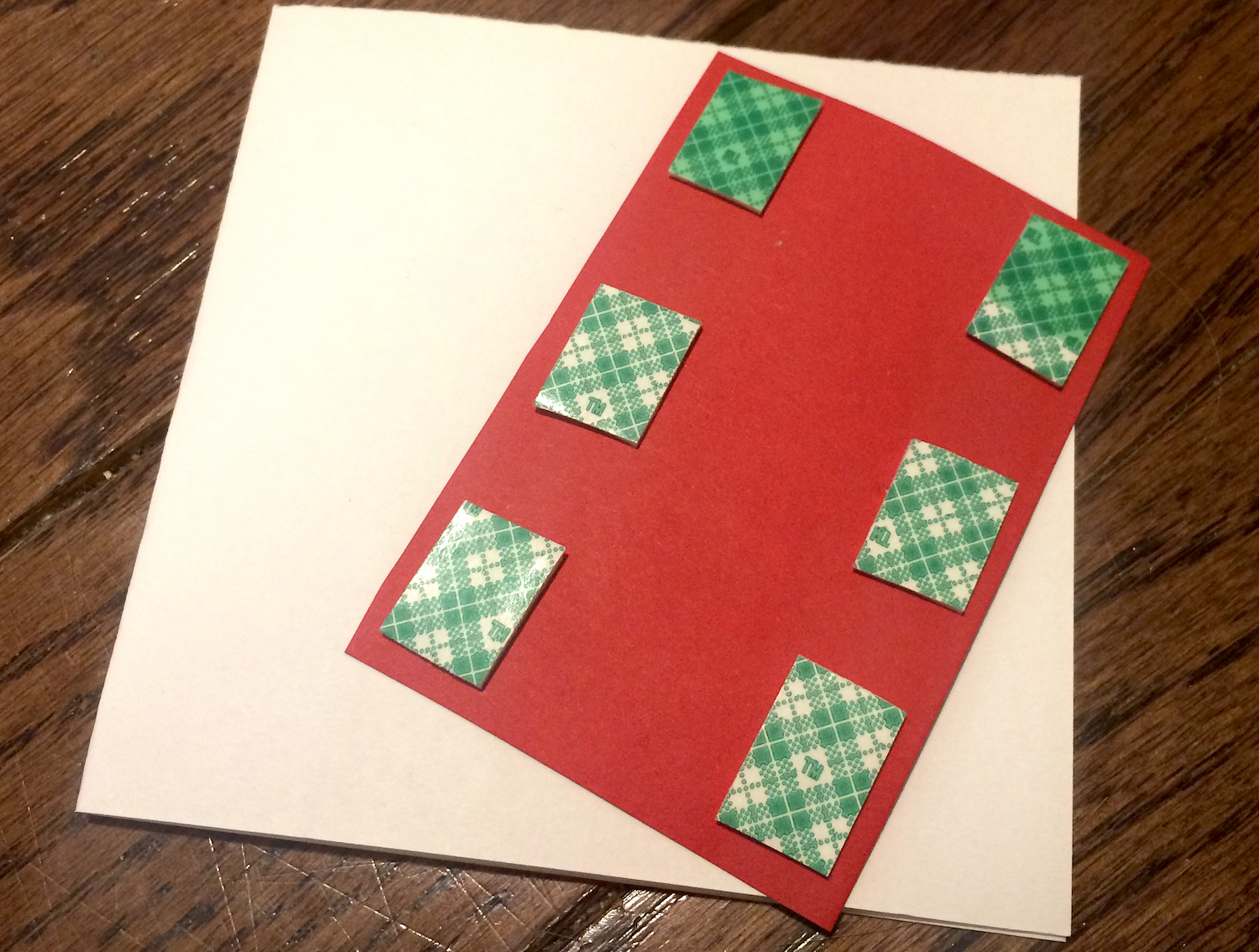
Finally, I peeled off the cover of the foam tape and stuck the pieces on the card. Hexbin Santa is ready to be deployed!
