Kibble analytics
From late April to early July last year, I was cat sitting for two lap cats. Originally alley cats from Montreal, they’re now living highly sheltered lives in a one-bedroom apartment in Toronto. Breakfast and dinner consists of wet food, and they have a near continuous supply of kibble to snack on throughout the day.
When their owner went off to Rhode Island for three months, I got the honour of looking after both the cats and the apartment. At the time, I was wrapping up my master’s degree, working part time on MPEDS, and looking for full time jobs. Without a lot of other fun things going on in my life, my dedication to the cats quickly spiralled out of control.
What started out as feeding them twice a day soon turned into an elaborate effort to catalog their food consumption. I kept two Google Sheets with the weight of their food bowls at various points throughout the day, and visualized the data through a few custom pipeline scripts in R. Or, as I told my friends, I was pioneering the field of kibble analytics! At the risk of seeming less sane than I am, I’ve done a full write-up of the results in this post.
Data Pipeline
With the possible exception of primary school projects, this project was my first foray into manual data collection. I’m used to having to deal with other people’s messy data, not generating it myself.
To minimize the effort involved, I kept track of the weight of the bowls themselves rather than the food. Every time I refilled food, I would first do an initial measurement to see how much food was left from the last meal. After refilling, I would measure the weight of the bowls again before making the food available to the cats. As part of the R pipeline, I would subtract the weight of the empty bowl to get the weight of the food.
Jenny Bryan’s googlesheets package has worked its way into most areas of my life over the past year and a half, and it seemed like the obvious choice for this project. I kept all of the raw data on Google Drive, and wrote a few helper functions (prepare.kibble() and prepare.wet.food()) to load the data into R.
In total I ended up with 663 measurements. 398 of these were of the wet food bowls, and the remaining 265 were kibble bowl measurements. Predictably, I was the most enthusiastic about the project in the beginning. At my best, I made 28 measurements in a single day! After about two weeks I got lazier, but still managed to keep up the data collection at a rate of at least four measurements a day until I moved out in early July.
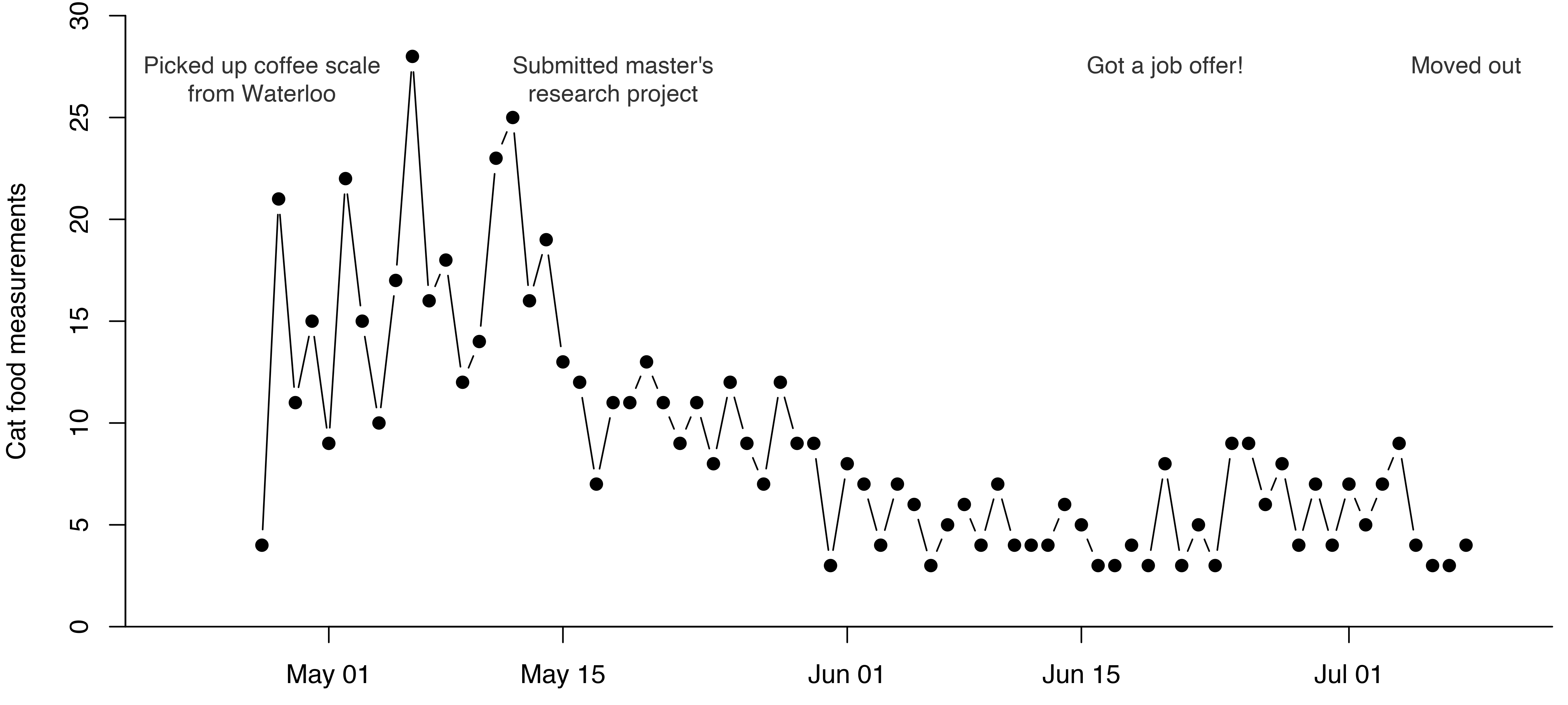
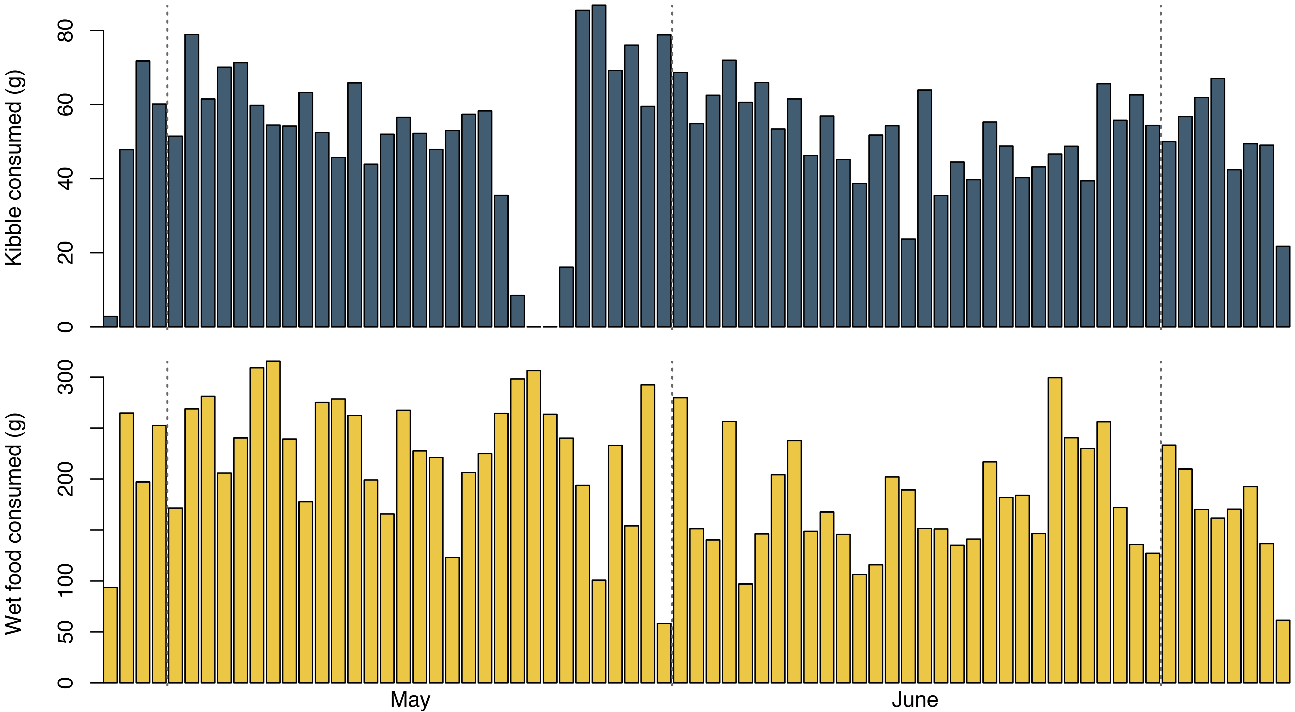
The cats were similarly consistent in eating the food I gave them. Aside from two days in late May when we ran out of kibble, they ate around 50 grams of kibble and one to two cans of wet food every day. Interestingly, the three-day kibble deprivation appears to have tipped food consumption in favour of kibble for about a week after it was put back on the menu – the first two days had the highest kibble consumption of the entire period.
Analysis
With the data and processing pipelines in place, it was time to start the analysis. At first, I didn’t have any particular questions I wanted to investigate. Like many modern businesses, I had data but no clear ideas on how it could help me. My first few weeks were spent making basic plots. A kibble dashboard, if you will.
I regained some sense of purpose after a friend of mine introduced me to CatterPlots. The package allows you to make R plots with cat-shaped points. It’s admittedly a visualization technique for the few, but it seemed perfect for this analysis. Armed with kitty-shaped plots, I embarked on some actual statistics.
Food Preference
I started by looking at the difference between wet food and kibble consumption. Kibble was generally available to the cats at all times, while wet food was distributed at most twice a day. It seemed pretty clear that the cats preferred wet food as long as it was available and fresh, and used kibble more as a last resort. To delve deeper into this, I tried modelling the food consumed as a function of the time since wet food was last distributed.
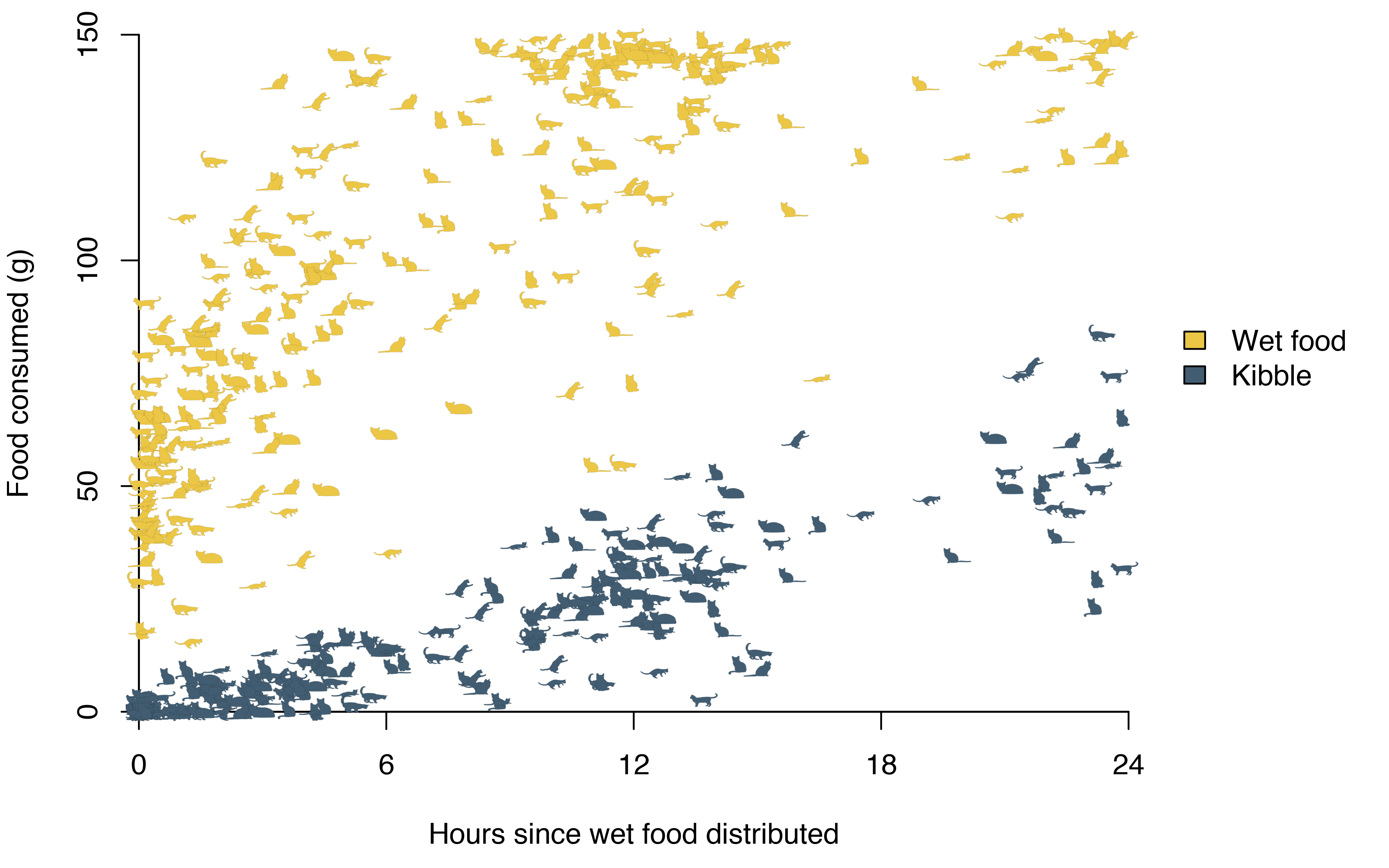
The wet food consumption is clearly non-linear in time, forcing me to look beyond linear regression.
In the beginning, I didn’t have enough data for good non-parametric estimates. Standard scatterplot smoothers like LOESS model the response based on data in a neighbourhood, and only imposes a smoothness restriction on the global function. In my case that resulted in local dips in the function, which didn’t make sense. On average the cats should have consumed at least as much food after five hours as after four, and I wanted a regression method that would accommodate this constraint.
Isotonic regression is a basic approach to non-decreasing, non-parametric regression. For a set of response variables \(y_i\) ordered by a covariate \(x_i\), isotonic regression seeks to find a set of predicted values \(\hat{y}_i\) that minimize
\[\begin{equation} \sum_{i=1}^n w_i \left( y_i - \hat{y}_i \right)^2 \end{equation}\]
subject to the constraint \(\hat{y}_1 \leq \hat{y}_2 \leq ... \leq \hat{y}_n\). If we ignore the weights \(w_i\), this amounts to finding the step function that minimizes the least squares criterion for the response \(y\).
The R function isoreg() implements isotonic regression. It takes vectors of \(x\) and \(y\) values as input and returns an object that can be converted into a step function. The step function can then be called to predict the response \(y\) for any new value \(x\).
While obtaining the regression estimates was easy, superimposing them on the plot required some acrobatics. Internally, CatterPlots works with data on a \([0, 1]\) scale. To add the regression curves to the plot, I had to first scale the \(x\) and \(y\)-values with the non-exported CatterPlots:::scaleData() function1.
# limits on plot
hack.args <- list(
    xlim = c(0, 24),
    ylim = c(0, 150)
    );

kibble.regression <- isoreg(
    y = kibble$food_consumed,
    x = kibble$time_elapsed
    );

x <- seq(0, 24, by = 0.01);
scaled.kibble.regression <- CatterPlots:::scaleData(
    x,
    as.stepfun(kibble.regression)(x),
    args = hack.args
    );

lines(
    scaled.kibble.regression$xscale,
    scaled.kibble.regression$yscale,
    lwd = 3,
    col = kibble.colour
    );
The result is a rather uninviting step function overlaid on the cats.

Frustrated with the decreased aesthetic appeal, I set out in search for non-parametric regression methods that would give me smooth, monotone increasing functions. The R package monreg implements an approach based on a monotone transformations. Given an initial non-parametric regression function \(\hat{m}(x)\), it estimates the inverse of the monotonized version through the formula
\[ \hat{m}_I^{-1} = \frac{1}{Nh_d} \sum^N_{i=1} \int_{-\infty}^t K_d \left( \frac{\hat{m}\left(\frac{1}{N}\right) - u}{h_d} \right) du\]
where \(K_d\) is a kernel density estimator with bandwidth \(h_d\). Afterwards, a monotone non-parametric function \(\hat{m}_I\) is obtained by taking the inverse of \(\hat{m}_I^{-1}\). The result is a much more pleasing, smooth function that looks similar to what you would obtain using standard standard scatterplot smoothers.
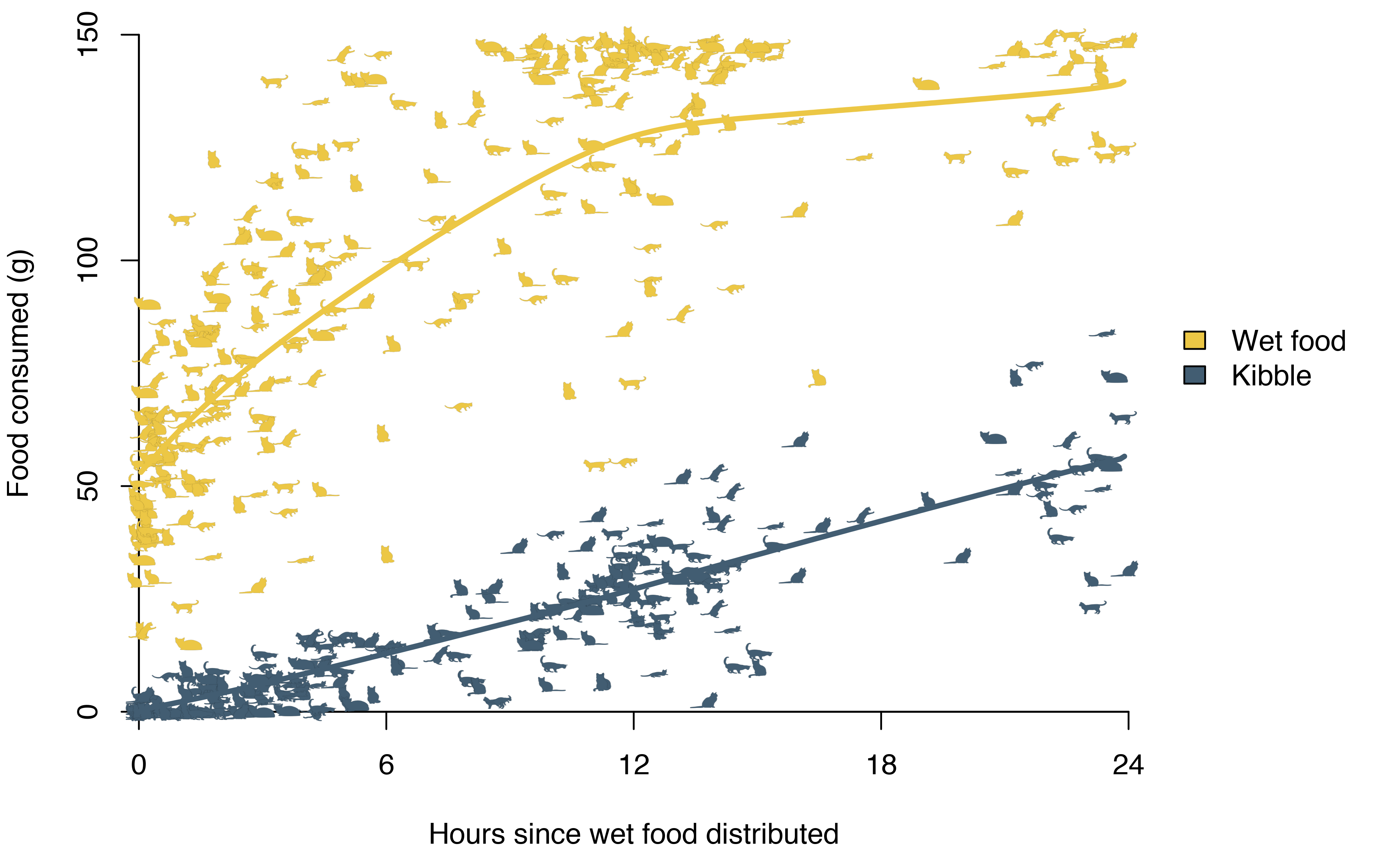
The smooth functions also make it easier to see patterns. Kibble consumption is roughly linear, while wet food is eaten more quickly before consumption levels off. A can contains around 150 grams of wet food, and on average the cats ate 127 grams in the first 12 hours. In most cases they would have been served a new meal at that point, but on days that they weren’t, wet food consumption continued to increase very slowly – presumably because food had either run out or gone stale. By contrast, the average kibble consumption by 12 hours was 27 grams, and this continued to grow linearly to an average of 56 grams eaten by the 24 hour mark.
The differences are smaller when we consider the amount of nutrients rather than the weight. Like the name suggests, wet food contains a considerable amount of water. Repeating the analysis for protein consumption rather than total food consumption reveals that kibble overtakes wet food as the main source of protein after roughly 18 hours.
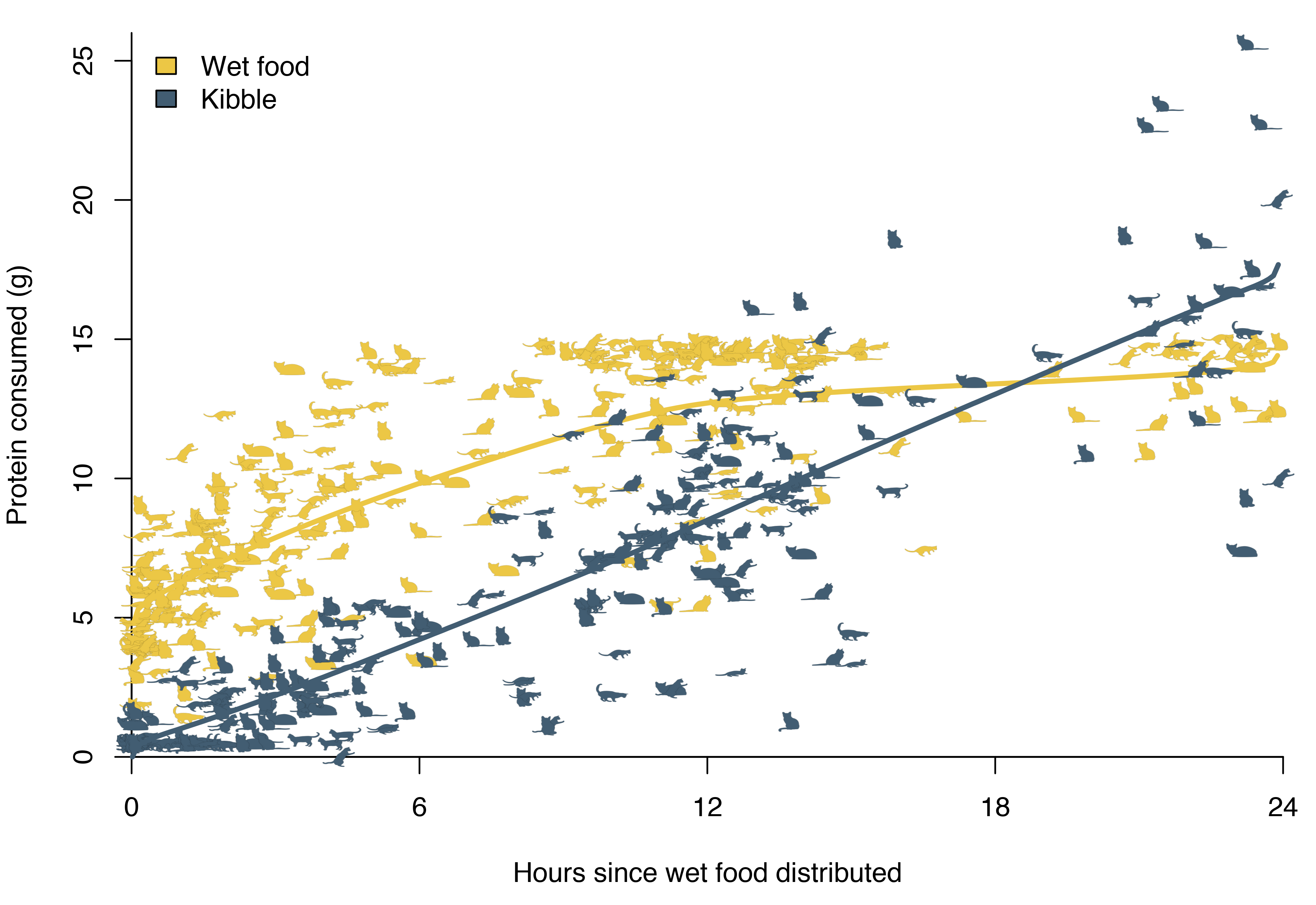
Nutrients can also explain some of the cats’ eagerness to eat kibble after the three-day deprivation of late May. When only eating wet food, they would get less than half of their normal intake of fibre.
| Nutrient | Kibble (%) | Wet food (%) |
|---|---|---|
| Protein | 30 | 10 |
| Fat | 14 | 5 |
| Fibre | 10.5 | 1 |
| Moisture | 10 | 78 |
| Ash | - | 3 |
| Taurine | - | 0.5 |
Bowl Preference
After concluding on the kibble vs wet food question, I started digging deeper into the wet food dynamics. The cats had two wet food bowls with different shapes. When refilling food, I would try to split it evenly between the two bowls.
Initially, the different shapes of the bowls were simply an easy way to keep track of the food consumption. I created separate columns in my spreadsheet asymmetric_bowl_weight and symmetric_bowl_weight, and only calculated the total food remaining as part of my R pipeline. This setup made it easy to extend the analysis to consider the two bowls separately.
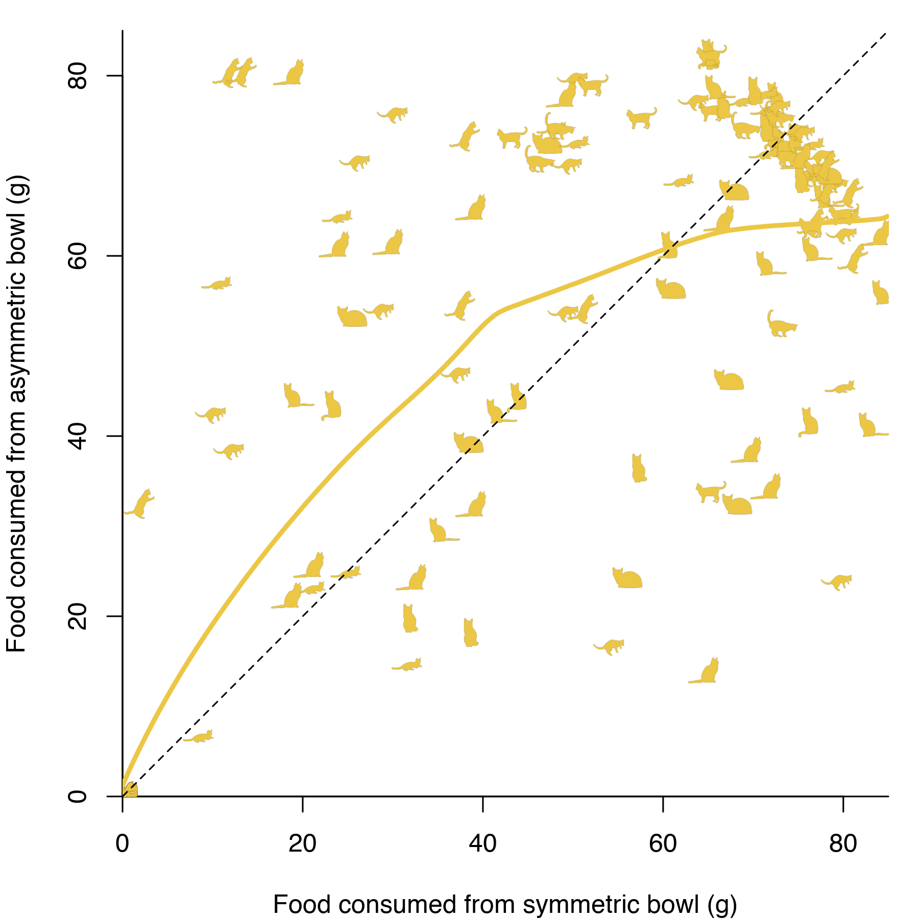
At first sight, it could seem the cats start by eating more from from the asymmetric bowl, although it’s not clear that the difference is statistically significant. There’s also a confounding factor in the spatial arrangement of the bowls. I lined the bowls up along the side of the kitchen, with one bowl closer to the living room (and the rest of the apartment) than the other. It seemed entirely plausible that the cats could exhibit a bias towards the first bowl they encountered on their quest for food.
To disentangle the effect of the bowl shape from the effect of the spatial arrangement, I launched a new experiment. Every time I refilled the bowls, I would randomize their relative position and record it in a new column in my spreadsheet.
Analyzing this data turned out to be more difficult than expected. The non-parametric monotone regression framework does not lend itself easily to significance testing, and I reverted to a standard linear regression model. To make those assumptions slightly more realistic, I focused on the first twelve hours after wet food had been served.
I also wanted to restrict the analysis to time points when the cats had a choice. If one of the bowls was empty, I imagined they would go for the other one, regardless of any personal preferences for the shape of the bowl. To avoid biasing the analysis, I only included time points where each bowl had at least five grams of food left.
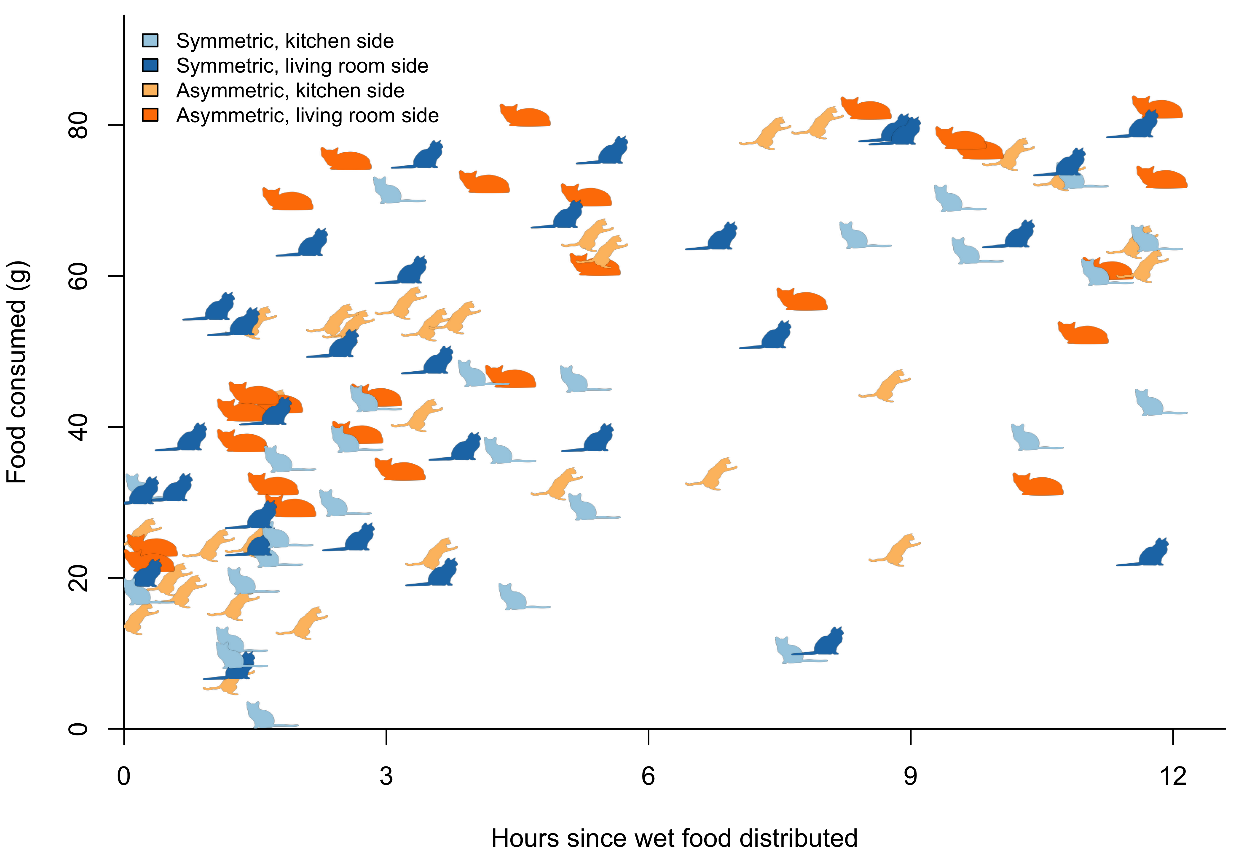
There’s one further complication. On some days, I would take multiple measurements within a short time frame. These observations are typically highly correlated, and in a standard linear regression model they would be given equal weight to observations from days when I only took a single measurement. To account for the correlation in the data, I grouped all of the observations according to the refill time stamp and included this group as a random effect.
Fixed effects: food_consumed ~ bowl + closest_livingroom * time_since_refill +      bowl * time_since_refill
                                             Value Std.Error DF   t-value p-value
(Intercept)                              24.416994  4.126351 71  5.917333  0.0000
bowlsymmetric                            -3.189013  5.306992 71 -0.600908  0.5498
closest_livingroomTRUE                   14.078871  5.238359 71  2.687649  0.0090
time_since_refill                         3.841742  0.593709 71  6.470746  0.0000
closest_livingroomTRUE:time_since_refill -0.586184  0.720174 71 -0.813947  0.4184
bowlsymmetric:time_since_refill          -0.410452  0.721227 71 -0.569101  0.5711
Contrary to what I expected, there’s no statistically significant difference in the rate of consumption over time. However, the bowl closest to the living room has a significantly higher baseline consumption. When served a new meal, the cats would immediately eat an average of 25 grams from the kitchen side bowl and 39 grams from the bowl on the living room side. By contrast, there’s no evidence of any preference based on the shape of the bowl.
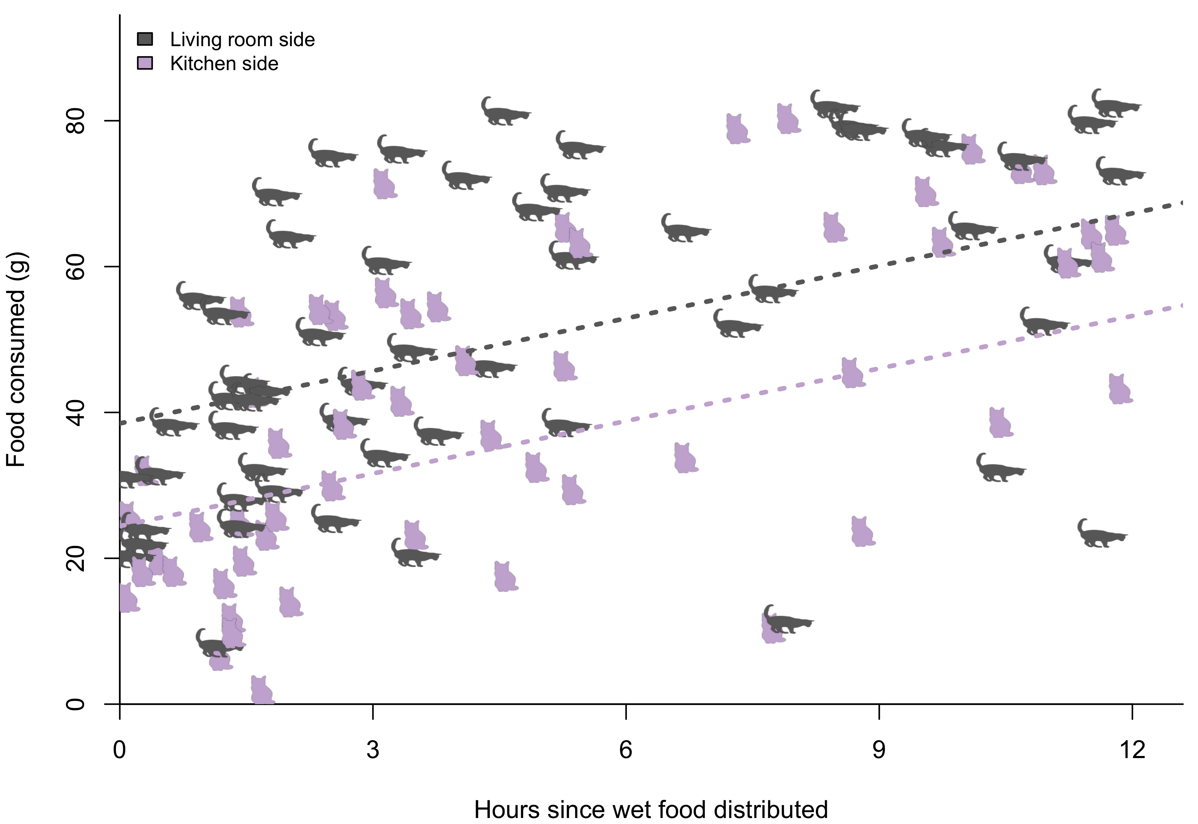
I don’t have a good explanation for this. One unexplored possibility is that it could relate to the personal preferences of each cat. As everyone who visited me that summer would remark, one of the cats was considerably bigger than the other. It’s possible that the cat that would eat the most also tended to position himself on the living room side. Without a more invasive follow-up study that records the food consumption of the individual cat, there’s no way to validate this hypothesis.
Association with Temperature
Finally, I looked at whether there was any association between the cats’ food consumption and the weather. I downloaded daily temperature data for Toronto Pearson International airport from the Government of Canada website and correlated it with the total food consumption (kibble and wet food) of the cats.
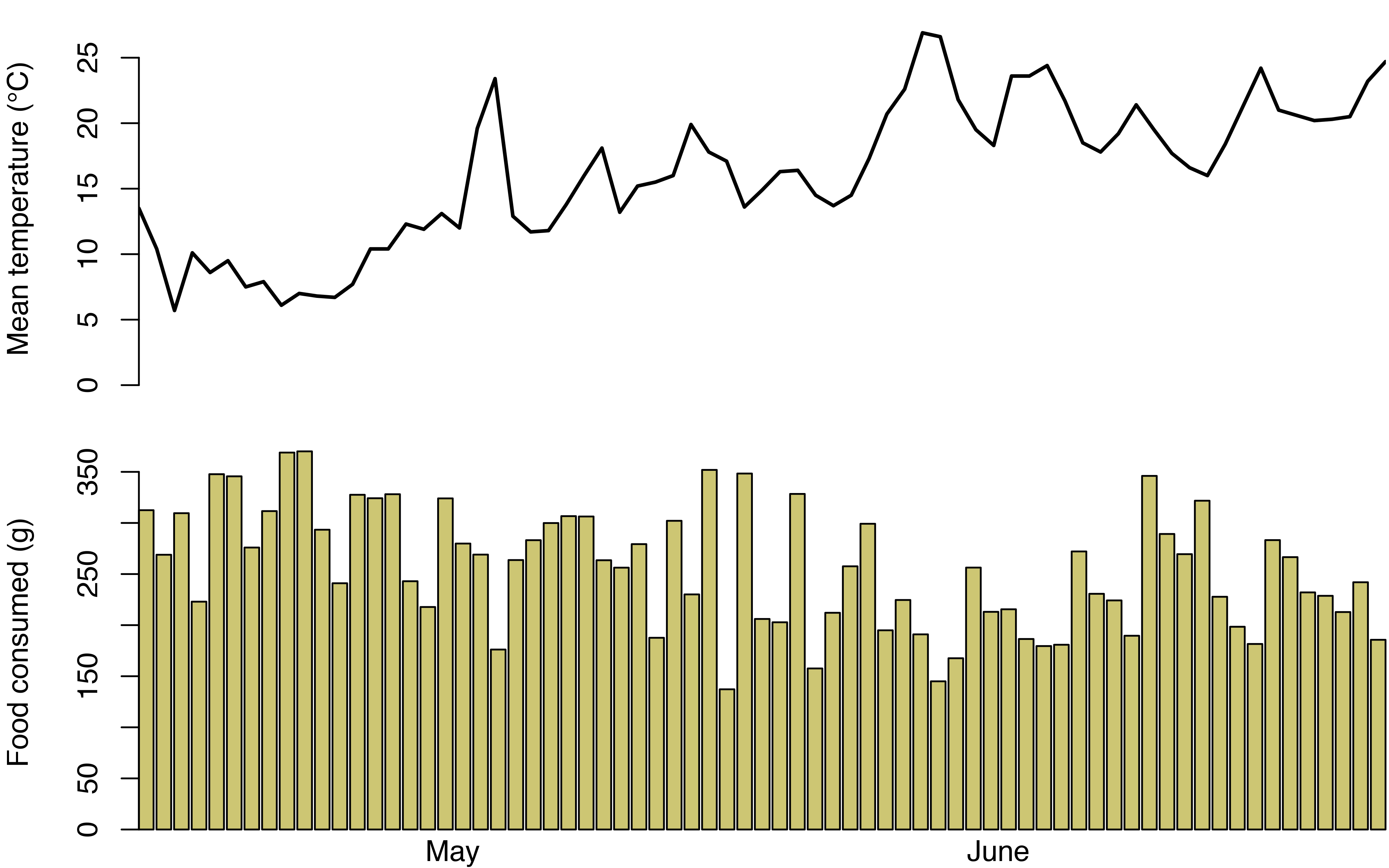
Spring in Canada is typically miserable. For my first few weeks of cat-sitting, the temperatures hovered around 10 degrees Celsius. Towards the end of my stay they reached the 20-25 degree range, and at first glance it seems the average food consumption was slightly lower.
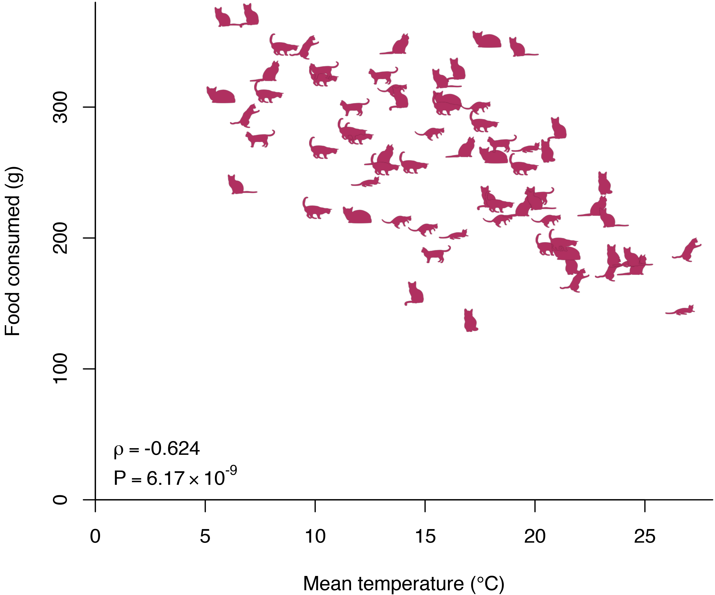
This effect gets far more pronounced when we look at the data in a CatterPlot. The Spearman’s correlation is a staggering -0.62! Translating this into a regression framework, we expect the cats to eat seven grams less a day for every degree increase in average daily temperature.
Conclusion
Since moving to London, I have spent considerably less time on cats. The only four-legged creatures in my current apartment are mice, and the food we give them would turn similar projects into survival analyses. But even if I won’t be doing a follow-up study any time soon, I’ve thought about some limitations of this project.
For one thing, I never randomized the measurement times. To avoid data collection feeling too much like a chore, I only weighed the food bowls when I felt like it. Of course, this opens up the possibility that I could have been influenced by the cats’ behaviour. If I noticed they were eating at unusual times, I might have been more inclined to get off the couch and take out my coffee scale.
Another problem related to the cats themselves. Not a friend of science, Cat 1 was caught splashing water into their kibble bowl on several occasions. While I tried to let the disaster area dry out before weighing the bowl, I’m not sure I succeeded.
If you think you can do a better study yourself, all of the code is available on GitHub.
Acknowledgements
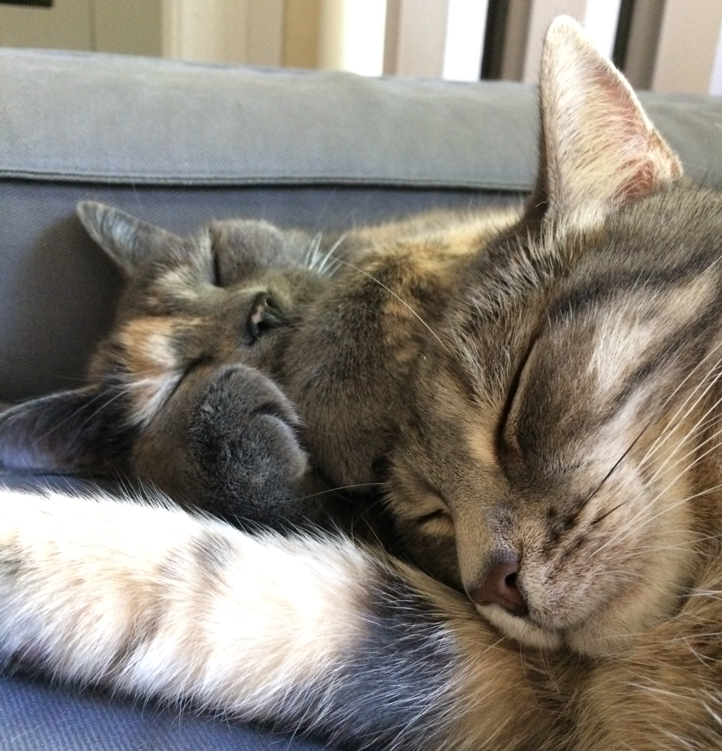
None of this would have been possible without the love and support of the experimental subjects themselves, Smoke and Brindi. I also have to thank VK for supplying the cats, Vinny for introducing me to CatterPlots, and Paul for making sure I normalized my data.
References
Dette, Holger and Regine Scheder. “Strictly Monotone and smooth nonparametric regression for two or more variables”. (2005)
Mair, Patrick, Kurt Hornik, and Jan de Leeuw. “Isotone optimization in R: pool-adjacent-violators algorithm (PAVA) and active set methods.” Journal of statistical software 32.5 (2009): 1-24.
Footnotes
For all of the code, see the GitHub repository↩︎